

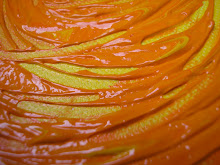
Some colors just go together, others don't look quite as right. And this applies whether you are a painter, fashion designer, decorator or whatever.
Nature though ignores this rule completely. Nature is not aware of the color wheel, of complementary colors or contrasting options. Nature has never heard the "rule" 'red and green should never be seen and blue and green should never be seen without something in between'. Nature's palette is determined by other factors and the result is amazing.
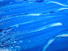
The ocean continually amazes me with its changing palette of shades of blue and turquoise and grey and green and silver and aqua.
The sky mixes various blues and white of clouds during the day and then exploding at sunset in reds and purples and oranges and corals and silver. Nighttime makes it black highlighted with the sparkles of stars, the greys of clouds. Sunrise is a muted palette of pastels in all shades.
Flowers of all sizes mix colors like an abstract painter under the influence of hallucinogens. And that doesn't even begin to describe who they choose to grow next to, or the planting patterns that we come up with.
And of course, fruit comes in all colors - eating a fruit salad is more than a collection of vitamins and different textures - it is a rainbow for the body. I personally, wouldn't have it any other way.
Writer's Daily Prompts


3 comments:
The colours in the pic certainly drew me to it - so vivid, clear and contrasting.
I must be a nature child because I hadn't heard that little colour rhyme. I cannot put colours together - I have to ask my family in the morning after getting dressed if my clothes go together....I just don't have that gene....but to walk in a colourful garden is one of my delights.
I love rainforest with its patchwork green cloaks and croaks. This is when I see colour, fabric and texture and know it all goes together.
Thanks for playing along with the Daily Prompts. I hope you are having fun.
I do good to color coordinate my outfits, but when it comes to decorating... forget it!
I'm getting ready to start a new art-project with one of the horses tomorrow and was trying to decide on what colors to use. The watermelon scheme is giving me pause for thought.
Good work Article is awosome i like Satta King by the next afternoon I'm chomping at the bit to get back to it.This is very good blogspot theme, where you can find out the best theme and latest designs Very good . Know what you mean. but You know about the Game which is viral soo fast in India play bazaar
Post a Comment